True Spring Color Palette: Warm, Clear Outfit Formulas
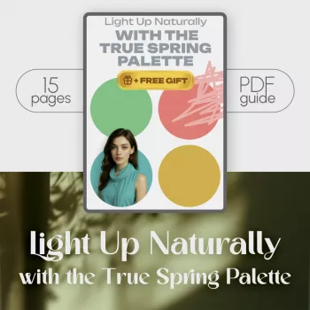
Light Up Naturally: The True Spring Palette for a Brighter, Clearer Wardrobe
True Spring colors look fresh, warm, and clear—like sunlight on new leaves. When you’re wearing the right warmth and clarity, your skin tends to look more even, your eyes look brighter, and your features appear defined without needing heavy makeup. The goal isn’t to dress like a rainbow; it’s to build a wardrobe where color feels easy, repeatable, and naturally “you.” For more guidance, see The Ultimate Guide to the True Spring Color Palette.
If you want a fast, consistent reference while you shop and edit your closet, a True Spring palette digital guide can help you compare warmth and clarity on the spot—especially when store lighting or online photos make everything look slightly “off.” For further reading, see True Spring Color Palette (Warm Spring): Complete Guide.
What “True Spring” Looks Like in Everyday Terms
Think warm + clear + lively. True Spring color has a clean, bright feeling (not muted or smoky), with warmth that reads sunny rather than brown-heavy. The best shades often look like they’ve got a drop of golden light mixed in—bright but not neon, warm but not rusty.
Common visual wins include a smoother-looking complexion, a healthier glow, and eyes that look more awake. Common visual misses include very cool grays, icy pastels, dusty tones, or deep autumnal browns that can pull warmth out of the face and make the overall look feel heavier.
Quick Self-Check: Signs You May Be True Spring
- Warmth is noticeable: gold jewelry often looks especially harmonious (though silver can work when it’s not overly icy or high-shine).
- Clear colors beat muted ones: crisp coral or warm turquoise tends to outshine dusty rose or slate blue.
- Black-and-white contrast can feel harsh: warm navy, cream, and camel-like warms usually feel more natural.
- Hair and eyes read “clear”: not necessarily light—just bright and defined, with overall warmth present.
True Spring Color Families That Usually Flatter
Color is contextual—surrounding shades change how a color reads, a principle well-known in color theory and perception (see Encyclopaedia Britannica’s overview of color). Still, these families are consistently friendly for many True Springs:
- Reds & pinks: coral, warm strawberry, poppy, tomato red (skip bluish fuchsia and wine).
- Oranges & yellows: apricot, tangerine, marigold, butter yellow (avoid mustard-brown and icy lemon).
- Greens: leaf green, chartreuse, warm mint, spring grass (avoid dusty sage and deep forest).
- Blues: warm turquoise, aqua, warm-leaning robin’s egg, clear teal (avoid steel blue and indigo-heavy navy).
- Neutrals: ivory/cream, warm beige, camel-light, warm navy, light cocoa (use pure black sparingly).
True Spring Wardrobe Color Cheat Sheet
| Category | Reliable picks | Use it for | Easy swap if you default to cool tones |
|---|---|---|---|
| Light neutrals | Ivory, cream, warm sand | Tops, outer layers near the face | Swap crisp white for ivory |
| Deep neutrals | Warm navy, espresso-light, warm charcoal-brown | Pants, skirts, jackets, shoes | Swap black for warm navy |
| Accent brights | Coral, poppy, turquoise, leaf green | Scarves, bags, statement tops | Swap fuchsia for coral |
| Soft accents | Apricot, warm blush, butter yellow, warm mint | Knits, blouses, casual layers | Swap dusty rose for apricot |
Building a True Spring Capsule Without Starting Over
The fastest way to make your closet feel more “True Spring” is to adjust what sits closest to your face—tops, scarves, jackets, and eyewear frames. Start with a few high-rotation pieces in dependable shades like ivory, coral, and warm turquoise.
- Start near the face: add 2–3 tops in True Spring-friendly shades (ivory, coral, warm turquoise).
- Upgrade neutrals next: use warm navy or warm beige as your base instead of black and cool gray.
- Add connector pieces: warm-wash denim, a camel-light jacket, or a cream cardigan helps your colors mix effortlessly.
- Keep patterns warm and clear: look for ivory backgrounds and sunny accents; limit gray/black in prints.
- Choose repeatable formulas: cream top + warm navy bottom + coral accent is a reliable “default setting.”
Outfit Formulas That Make True Spring Colors Wearable
Accessories, Metals, and Finishes That Match the Palette
If you love warm metallic details, consider decor and accessories that echo your best finishes—like the Natural Marble Tissue Box with Gold Accents for a subtly warm, polished touch in your space.
Makeup and Hair Color Notes for a True Spring Look
Common Mistakes That Make Spring Colors Feel “Off” (and Simple Fixes)
Using a Digital Palette Guide to Shop and Style Faster
For outfit planning, use a simple repeatable structure: pick a warm neutral base, add one True Spring accent, then rotate accent colors across the week. If you want a ready-to-use reference you can keep on your phone, the True Spring palette digital guide is designed for quick decisions while shopping, packing, or planning outfits.
FAQ
How is True Spring different from Light Spring or Bright Spring?
True Spring is primarily warm and clear with medium brightness, so colors look sunny and clean without feeling neon. Light Spring shifts lighter and softer (more pastel-leaning), while Bright Spring pushes higher intensity and contrast, sitting closer to Winter in overall “pop.”
Can True Springs wear black?
Yes, but black can look harsh near the face. Warm navy, espresso-light, or a warm chocolate brown usually flatter more; if you do wear black, add a True Spring-bright accent and choose warmer makeup and metal finishes.
What are the easiest True Spring colors to start with if a closet is mostly neutrals?
Start with ivory/cream, warm navy, warm-wash denim, coral, and warm turquoise. Easy formulas include cream top + warm navy bottom + coral accessory, warm denim + ivory tee + turquoise layer, or warm navy dress + gold jewelry + apricot lip.











Leave a comment